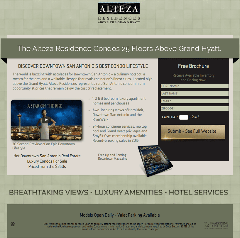
Tempting someone to click on your ad is half the battle. The landing page is the other half. The landing page is the first page your online prospects are taken to after they click your ad. It simplifies the clutter in front of users and clarifies the task you would like them to complete. Here at Cotton & Company we understand that without quality landing pages, you will never fully optimize your true lead generation potential.
DO’s
1. ESTABLISH YOUR GOALS. Know your marketing goals and what you are trying to accomplish. Don’t try to ask the user to do too many things at once. Is your call-to-action clear? Do you want downloads for a free magazine? Floorplan views? Open House RSVPs?
2. CONSIDER YOUR TARGET MARKET. Who is coming to your landing page? Consider their demographics, location and interests. What we may design for a hot new condo downtown may look very different than what we develop for a baby boomer community in the suburbs.
3. KEEP THE PAGE CLEAN AND EASY TO READ. Don’t overload your visitors with too much information. Give them exactly what they are looking for. Short and sweet. This will allow for better conversions.
4. A CALL-TO-ACTION. Always ask your visitors to take action depending on your goal. A landing page should clearly communicate your goal – perhaps your community’s USPs or details for an upcoming broker event – and then ask for a clear, and measurable, response from your visitor.
5. ALLOW VISITORS TO SHARE! The strongest messages can come from your customers. We promote word-of-mouth by using sharing tools via email and social media.
DON’Ts
6. BE INCONSISTENT. Make sure you connect the dots between ad and landing page and deliverable, keeping up with all of your brand standards.
7. RUSH THE GO-LIVE PROCESS. There is a process for a reason. All testing and tracking needs to be in place before you go live.
8. REQUIRE TOO MANY FIELDS. Today, people are used to convenience and getting what they want fast. If you’re offering a free guide, but want their entire personal history to give it, they will give up, bounce out, and you’ll lose the conversion opportunity. Make it easy for them and they’ll convert more often.
9. INCLUDE FLUFFY MARKETING COPY. There is no need to give your potential costumer a lengthy background on the company or include fluffy, jargon-filled marketing copy. Landing pages perform best when keyword-rich and specifically optimized. Trying to over-describe your amenities will not do you any favors. The content should be simple, clear relevant and useful.
10. ASSUME YOU KNOW WHAT THEY WANT. This applies to copy length, button color, design, background image selection. Every piece of your landing pages should be tested and analyzed for optimization throughout the entirety of your campaigns.


