Many would argue that art is timeless but design is not. In fact, timeless design is almost an oxymoron but timeless art is accepted by many. If that is the case, then consider the design of something as banal, yet as useful as a spoon. From the oldest to the newest, the basic design of a spoon has not changed for years. That does make it timeless, doesn’t it? Look at a bespoke suit, the Volkswagen Beetle, Le Corbusier’s buildings. All of them are classic examples of classic designs.
A particular style can’t emerge and expect to stay at the top indefinitely. Designers indicate that trends have a short lifespan, going through a “now-you-see-it-now-you-don’t” kind of roller coaster. New trends emerge only to be contradicted by others that go the opposite direction. Classic, timeless design never goes out of style.
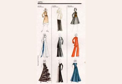
Valentino has always been one of my favorite fashion designers. To me, he is one of only a few designers who creates pretty clothing. And no, pretty is not a dirty word. Oh sure there are those fashion mavens who prefer clothing that is esoteric, architectural, conceptual, and the like. And yes, sometimes that clothing can be interesting to look at. But at the end of the day, don’t women want to look beautiful and feminine? What struck me is how many of his designs from the 1950s and 60s look so current, proving that classic, feminine design never goes out of style. So why should we devotees of graphic design discuss a fashion designer? Because we have much to learn from the likes of Valentino. Had Valentino’s career been marked by tricks and trends, I don’t think he would have survived in the fickle world of fashion for as long as he did.
But we are more interested in timeless beauty of design in the industry of printing, aren’t we? It didn’t take me long to decide what printed piece I’d like to consider as a great example of classic timelessness in graphic design. Let’s talk a little about the design of National Geographic magazine.
Who isn’t familiar with that wonderful yellow frame of the National Geographic magazine’s cover? It holds breathtaking images of exotic destination and mountains of nostalgia! It’s the flag of the editorial institution that National Geographic has established over the span of 120 years. The famous yellow rectangle has seen virtually no change, much like the interior pages, since it first bordered the front covers of the 1888 launch issue. I thought it could teach us a few things about timelessness in graphic design. National Geographic’s front cover is a great example of how well simple branding can be tied to a product or message. In this case, the slightly warm yellow has become a symbol of wonderful photography, intriguing articles and serves as a doorway into places worlds away. The text pages have photo spreads that introduce the article and then have gentle introductions into the actual content. The pages treat the typography with much respect and the spreads are wonderfully executed. I’ve always wanted to have a closer look at the design of National Geographic. While it might not set the world on fire, it’s always been solid. Timeless design like this is essential in creating a reason for leaving the copies on your shelves for years and years, which many of us are guilty of.
So often designers are faced with the challenge to create designs that break a mold so they may be called “creative,” “fresh” or “new”. But are they really timeless or universal? Perhaps they look “cool.” Perhaps they look “different,” but how do they actually look and feel to the users? To reach timelessness, your designs need to be carefully thought out and your intentions need to encompass both the complex and the simple. These basics elude many designers. Although they may seem obvious, they are often quite difficult to truly achieve.
So what are the keys for success in basic design?
In my opinion, the design shouldn’t uselessly babble and scream until it’s foaming at the mouth.
It should speak clearly and be easily understood. It should have a charming level of clarity and character as all parts are given a reason for taking up space.
It has to be quickly and easily understood, as elements accent the message and design, never drowning them.
Everything on the page is there to support the message and show its innate character. The way in which these elements are laid out is very important. Each word must give way to the next. Each block of text must guide the eye to the following.
It is what good design is all about — communication. It is this elegant simplicity that we mustn’t forget, as it’s what makes the work of the designer classically beautiful and timeless.


