Today we live in an environment surrounded by brand identities. It has been estimated that the average American is exposed to thousands of logos, advertisements and labels a day. How does your property stand out in this onslaught of images? Distilling a client’s persona into a single icon or mark that will capture the attention of their audience is at the heart and soul of the design process.
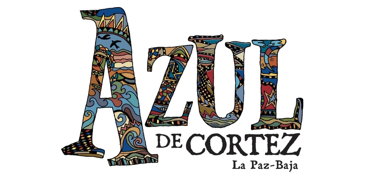
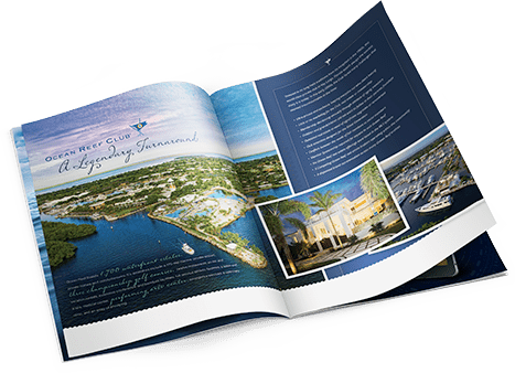
The best real estate logos showcase the particular property’s unique characteristics. Designers must stretch their thinking beyond clichéd choices to find the essence of the brand. It would be obvious to depict all oceanside properties, for example, in a blue or aqua font, or with variations of waves or boats, or all inland properties with images of palm trees and greenery. Those would be safe, but generic solutions. Even more challenging is competing with other properties that share the same locale and some of the same characteristics. Below is example logo design by Cotton & Company real estate marketing that best represents the successful merging of concept, design, originality, and branding.
For a conversation with Cotton & Company on how you can best create an identity that stands out for your brand visit cottonco.com to learn more.


